
Learning Center
News & Blogs

Apperson, Inc., A SOC 2 Type II Certified Company
Independent Service Auditor's Report on a Description of a Service Organization's System and the Suitability of the [...]
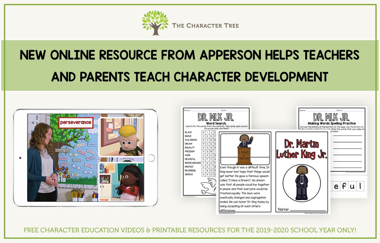
New Online Resource from Apperson helps Teachers and Parents Teach Character Development
Character education supports students’ social and emotional development and teaches them how to be productive, positive citizens [...]

Which Multiple Choice Form is Right For You?
Our most frequent question from our customers is “which form should I choose?” The most important [...]



Contact Us
Find our contact information below, or you can fill out the form and we’ll be in touch!
p: 1.800.897.1219
f: 1.800.321.8558
6623 S 228th St.
Kent, WA 98032
var fieldMaps = {};
/* Modied CSS for Bronto */
body {
background: #f3f3f3;
padding: 20px 5px;
font: normal 1em "Arial", "Helvetica", sans-serif;
color: #333;
margin: 0 auto;
}
/* The form element is the main container for the entire page and is centered on the page by default. This width is dynamically calculated based on the maximum width of the rows within it. */
form {
width: 100%;
max-width: 100%;
min-width: 240px !important;
height: auto;
background: #fff;
border: 1px solid #ccc;
padding: 15px;
margin: 0 auto !important;
overflow-wrap: break-word;
}
/* This is the style for each individual row. */
form .section {
clear: both;
width: 100%;
max-width: 100%;
}
/* This is the style for each column within a row. */
form .section .container {
width: 100%;
max-width: 100%;
float: left;
}
/* This surrounds every field and caption area. */
.field_block {
display: block;
padding: 0 0 8px 0;
margin: 0;
}
/* A field's caption normally surrounds its label element. */
.field_block .caption {
display: block;
font: bold 1em "Arial", "Helvetica", sans-serif;
color: #333;
padding: 0;
margin: 0 0 8px 0;
}
/* The following styles control the design and appearance of checkbox fields */
input[type="checkbox"] {
outline: none;
cursor: pointer;
position: relative;
-webkit-appearance: none;
-o-appearance: none;
appearance: none;
top: 8px;
height: 20px;
width: 20px;
text-align: center;
border: 1px solid #cccccc;
-webkit-border-radius: 0px;
-o-border-radius: 0px;
border-radius: 0px;
background-color: #f3f3f3;
transition: all 0.3s ease;
-webkit-transition: all 0.3s ease;
-o-transition: all 0.3s ease;
}
input[type="checkbox"]:hover {
background: #cccccc;
}
input[type="checkbox"]:checked {
background: #cccccc;
}
input[type="checkbox"]:after {
content: "";
text-align: center;
font: bold 1.2em "Arial", "Helvetica", sans-serif;
color: #ffffff;
}
input[type="checkbox"]:checked:after {
position: absolute;
content: "\02143";
transform: rotate(40deg);
margin-left: -4px !important;
}
/* The following styles control the design and appearance of radio fields */
input[type="radio"] {
outline: none;
cursor: pointer;
position: relative;
top: 4px;
display: inline-block !important;
-webkit-appearance: none;
-o-appearance: none;
appearance: none;
height: 20px !important;
width: 20px !important;
text-align: center;
border: 1px solid #cccccc;
-webkit-border-radius: 50%;
-o-border-radius: 50%;
border-radius: 50%;
background-color: #f3f3f3;
transition: all 0.3s ease;
-webkit-transition: all 0.3s ease;
-o-transition: all 0.3s ease;
}
input[type="radio"]:hover {
background: #cccccc;
}
input[type="radio"]:checked {
background: #cccccc;
}
input[type="radio"]:after {
content: "";
text-align: center;
font: bold 1.5em "Arial", "Helvetica", sans-serif;
color: #ffffff;
}
input[type="radio"]:checked:after {
position: absolute;
content: "\2022";
}
/* The following styles control the layout of checkbox and radio fields */
.field_block .checkbox .caption {
display: inline;
margin: 0;
}
.field_block div.radio span {
display: block;
margin: 8px 0;
padding: 0;
}
.field_block div.radio span input.radio {
display: inline;
padding-right: 5px;
}
.field_block div.radio span label {
font: normal 1em "Arial", "Helvetica", sans-serif;
color: #333;
}
/* This is the individual field input. */
.field_block .field {
padding: 0;
margin: 0;
}
/* The style for field-level errors */
.field_block .field .field_error {
display: block;
padding-top: 3px;
padding-bottom: 5px;
font-size: 1em;
color: #f00;
font-weight: 400;
}
/* The styles for individual field types */
.field_block .field input.text,
.field_block .field input.float,
.field_block .field input.password,
.field_block .field input.integer,
.field_block .field input.currency,
.field_block .field input.date {
outline: none;
cursor: pointer;
border: 1px solid #ccc;
font: normal 1em "Arial", "Helvetica", sans-serif;
/*color: #333; DLC */
padding: 8px 5px;
margin: 0;
}
.field_block .field input.date {
font-size: 1em;
width: 200px;
}
.field_block .field input.phone {
width: 200px;
font-size: 1em;
padding: 3px 12px 3px 44px;
}
/* The styles for textareas are slightly larger than by default with no CSS */
.field_block .field textarea {
width: 90%;
height: 150px;
}
/* This can be applied to any field element to make it wider than the default above */
.field_block .field input.wide {
width: 300px;
}
/* This can be applied to any field element to make it narrower than the default above */
.field_block .field input.narrow {
width: 100px;
}
/* The following styles are for dropdown menus and date pickers for date-based fields such as birthday or anniversary. */
/* DLC - Dropdowns */
select {
border: 1px solid #cccccc;
font: normal 1em "Arial", "Helvetica", sans-serif;
/*color: #808080;*/
width: 300px;
max-width: 100%;
margin-left: 5px;
outline: none;
padding: 2px 5px !important;
background: #ffffff
url("/static/static/img/jqui/drop_down_arrow_down-24px.svg")
no-repeat right;
background-position: 99% 50%;
-webkit-appearance: auto;
-webkit-border-radius: 0px;
border-radius: 0px;
-moz-appearance: auto;
}
.field_block .field span.ui-datepicker-wrap {
position: relative;
display: block;
}
.field_block .field span.ui-datepicker-wrap img.ui-datepicker-trigger {
position: absolute;
top: 3px;
left: 101px;
margin: 0;
float: none;
}
.field_block .field span.ui-datepicker-wrap input.date {
border: 1px solid #ccc;
border-top-color: #444;
border-left-color: #444;
font: normal 11px "Arial", "Helvetica", sans-serif;
color: #333;
padding: 3px;
margin: 0;
width: 90px;
}
.ui-widget-header {
border: 1px solid #888888;
background: #eeeeee;
color: #333;
font-weight: bold;
}
.ui-state-default,
.ui-widget-content .ui-state-default,
.ui-widget-header .ui-state-default {
border: 1px solid #eee;
background: #ffffff;
font-weight: normal;
color: #616265;
}
img.ui-datepicker-trigger {
content: url(/static/static/img/jqui/Calendar-24px.svg) !important;
width: 16px;
height: 16px;
}
.ui-datepicker-trigger {
margin: 10px 0 0 -24px;
position: absolute;
}
/* Required fields are red and bold by default. */
.required {
color: #f00;
font-weight: 400;
}
/* Change the appearance of the submit button */
input[type="submit"] {
font-family: "Arial", "Helvetica", sans-serif;
-webkit-border-radius: 0px;
-moz-border-radius: 0px;
border-radius: 0px;
border: 1px solid #333;
color: #333;
font-size: 1em;
font-weight: 400;
background-color: #fff;
padding: 10px;
width: auto;
min-width: 200px;
max-width: 100%;
text-transform: uppercase;
letter-spacing: 1px;
text-decoration: none;
text-align: center;
margin: 10px auto !important;
}
/* Change the hover appearance of the submit button */
input[type="submit"]:hover {
background-color: #333;
border-color: #333;
color: #fff;
-webkit-transition: all 0.25s ease-in-out;
-moz-transition: all 0.25s ease-in-out;
-o-transition: all 0.25s ease-in-out;
transition: all 0.25s ease-in-out;
}
/* Captcha elements are styled here. */
.g-recaptcha {
display: inline-block;
}
/* Media query for mobile devices starts here.*/
@media screen and (max-width: 747px) {
/* This is where mobile-specific styles for the form element should go. */
form {
width: 85%;
max-width: 85%;
}
/* This is where mobile-specific styles for each column within a row should go. */
form .section .container {
width: 100% !important;
max-width: 100%;
margin: auto !important;
float: none !important;
clear: both;
}
/* This is where mobile-specific styles for field types should go. */
.field_block .field input.text,
.field_block .field input.float,
.field_block .field input.password,
.field_block .field input.integer,
.field_block .field input.currency,
.field_block .field input.date {
width: 97% !important;
max-width: 97%;
margin-right: auto;
margin-left: auto;
}
.field_block .field input.date {
width: 97% !important;
max-width: 97%;
padding: 8px 0 8px 5px !important;
margin-right: auto;
margin-left: auto;
}
/* Change the appearance of the submit button on mobile devices. */
input[type="submit"] {
width: 100% !important;
max-width: 100%;
min-width: 200px;
clear: both;
}
/* Change the appearance of dropdown menus within a field on mobile devices. */
.field_block .field select,
.field_block .field select option {
width: 100% !important;
max-width: 100%;
margin-right: auto;
margin-left: auto;
}
}
Contact Apperson!
Email Address *
First Name *
Last Name *
Message Field